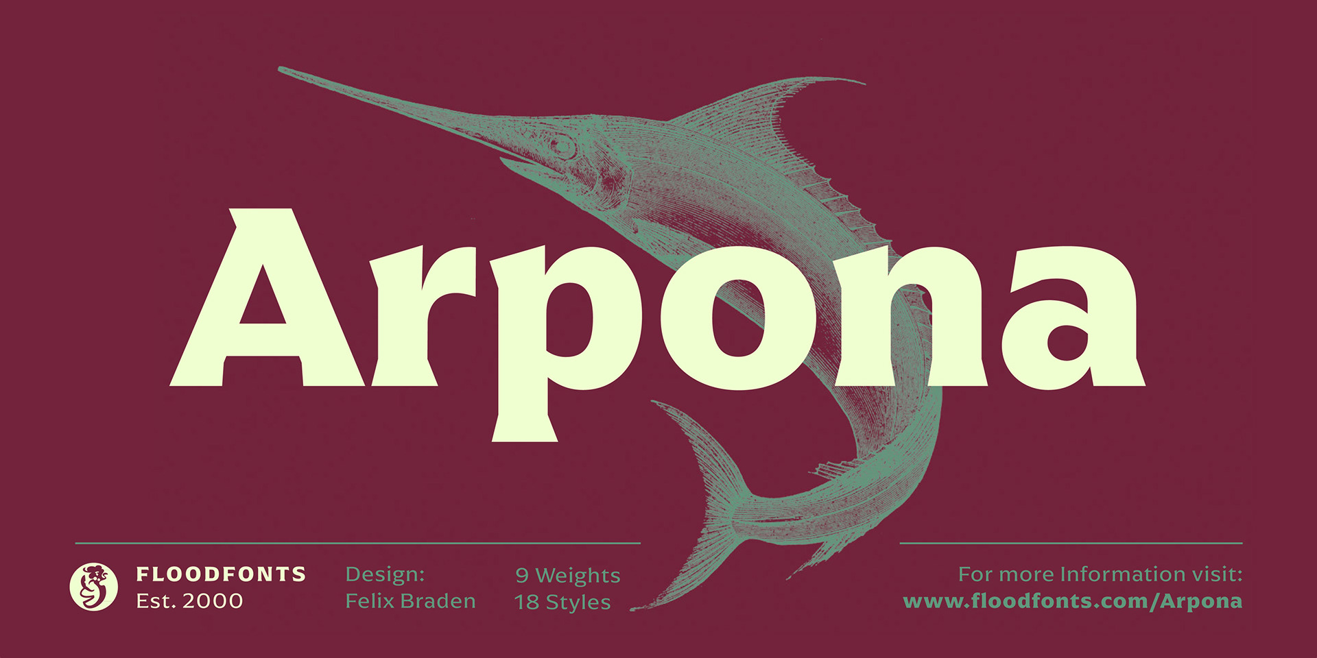
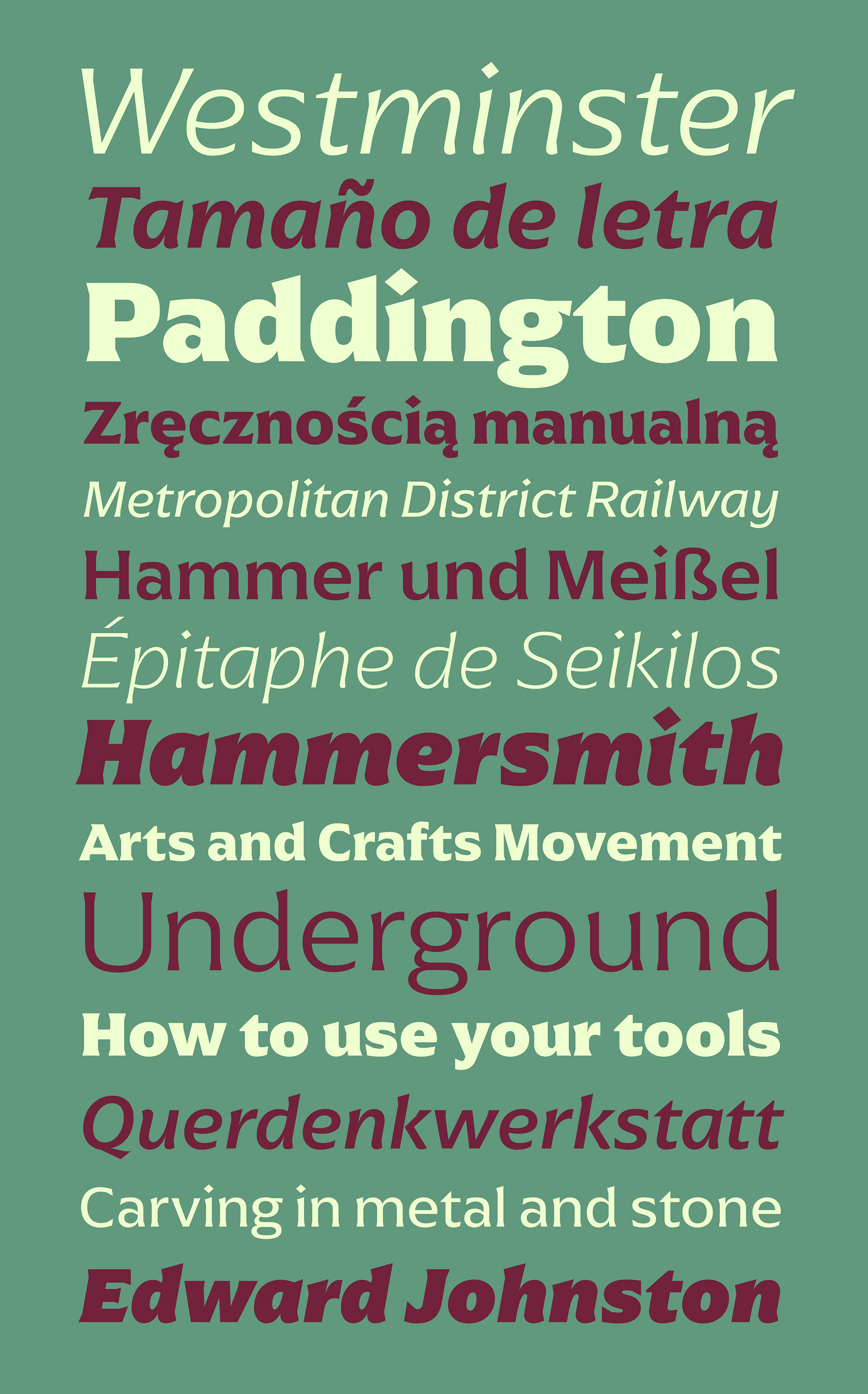
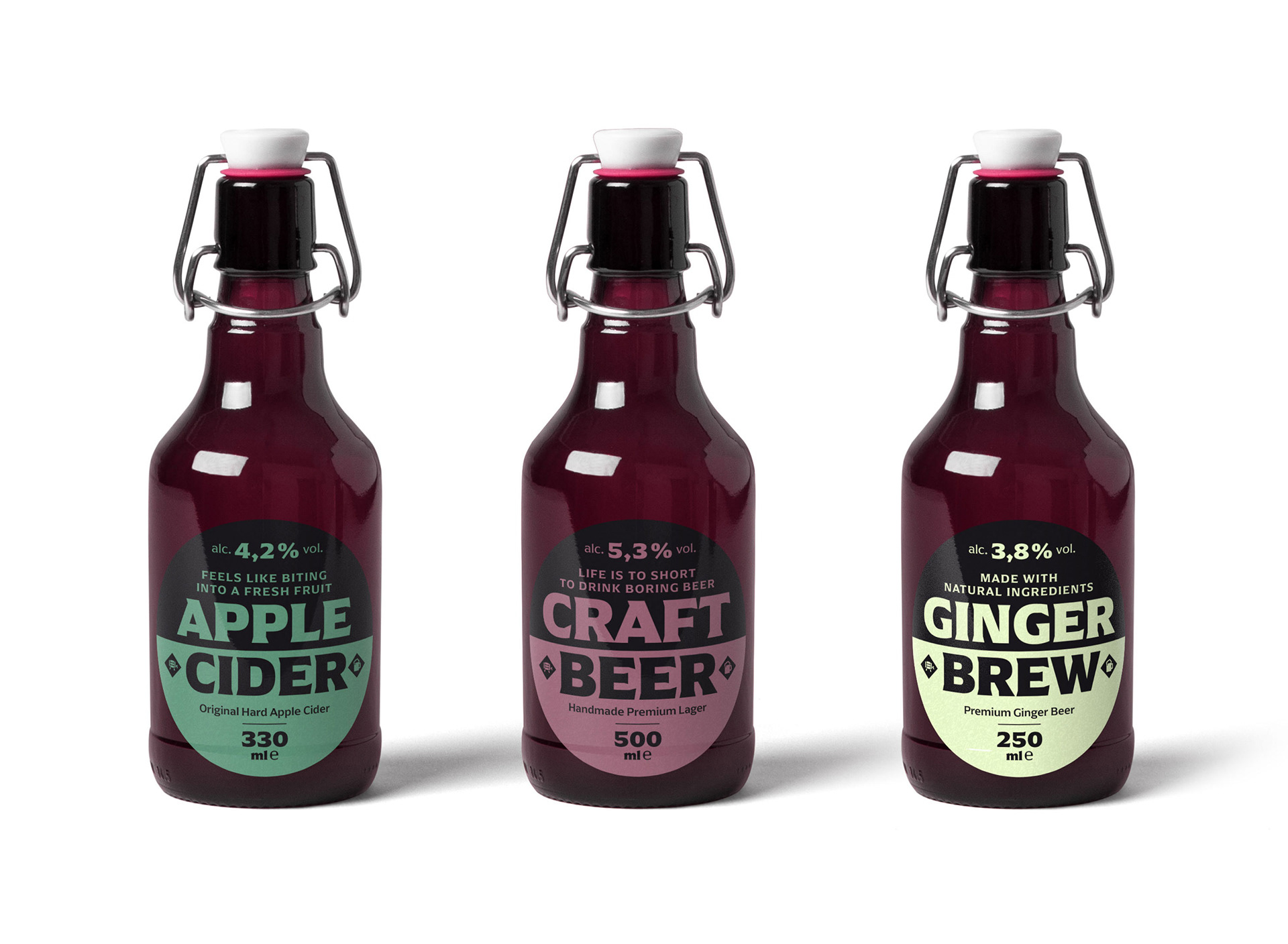
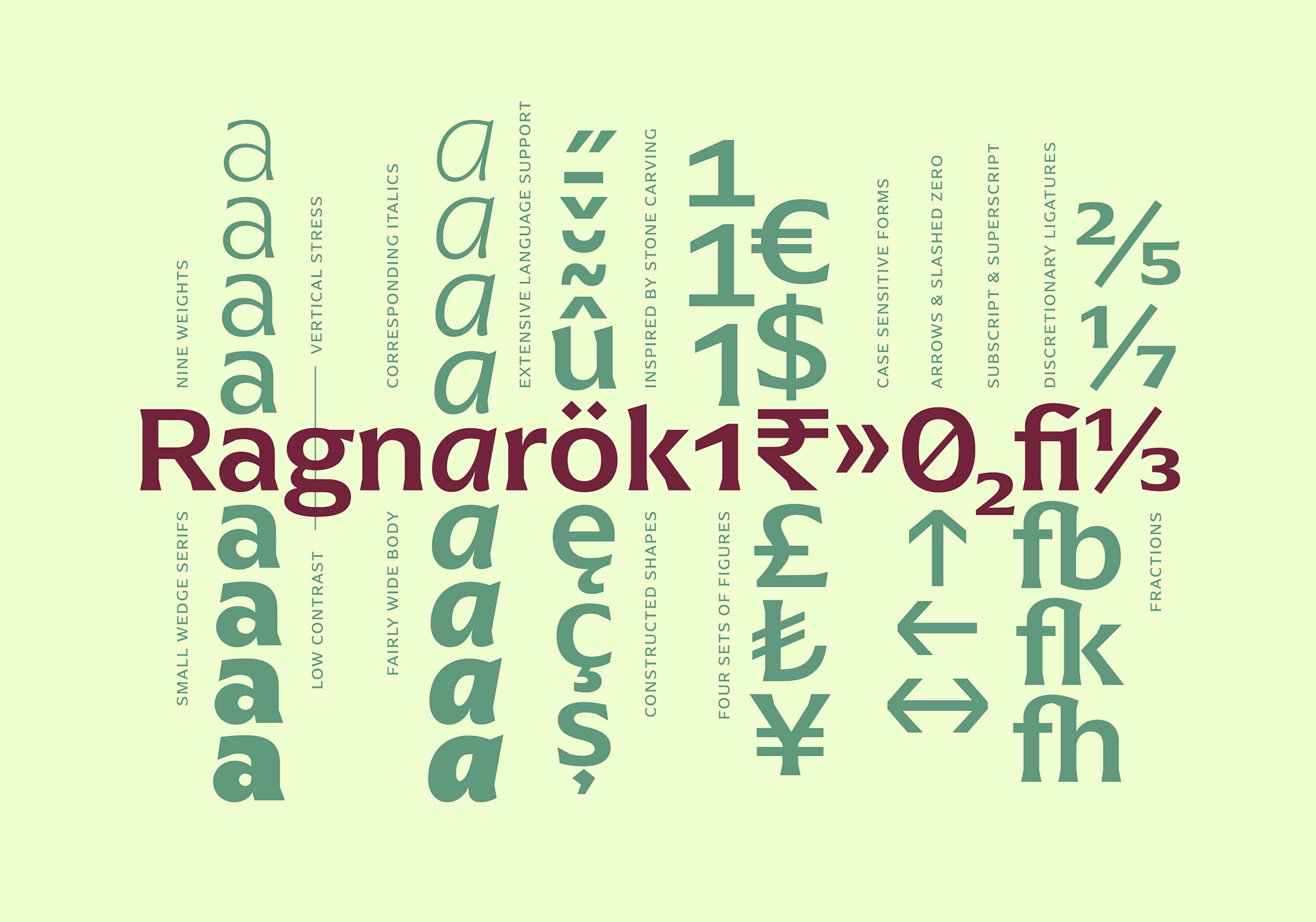
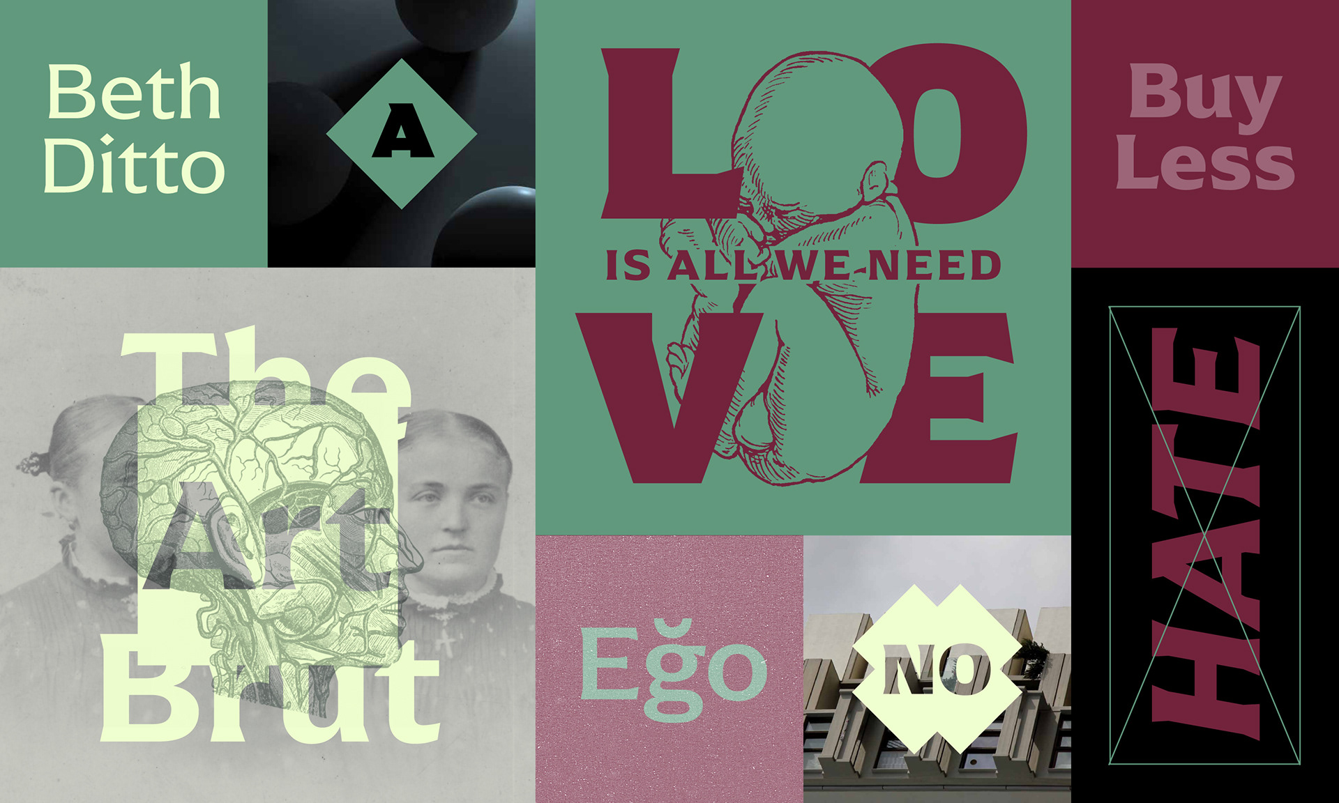
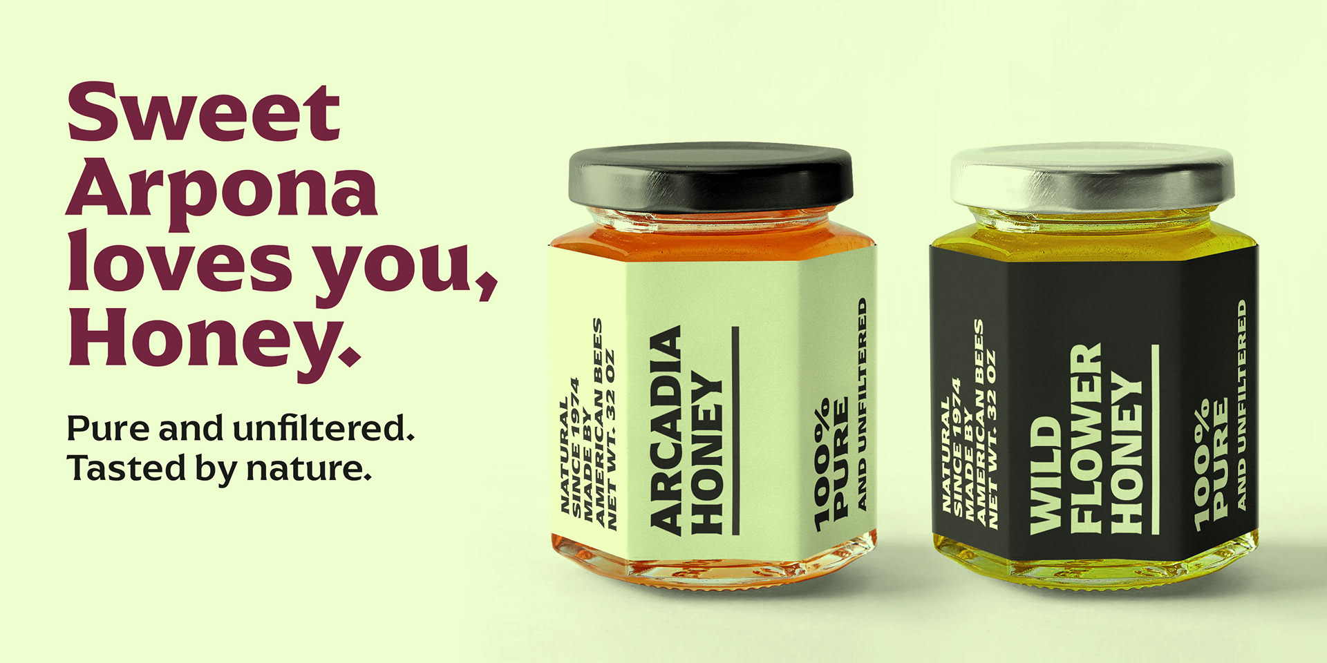
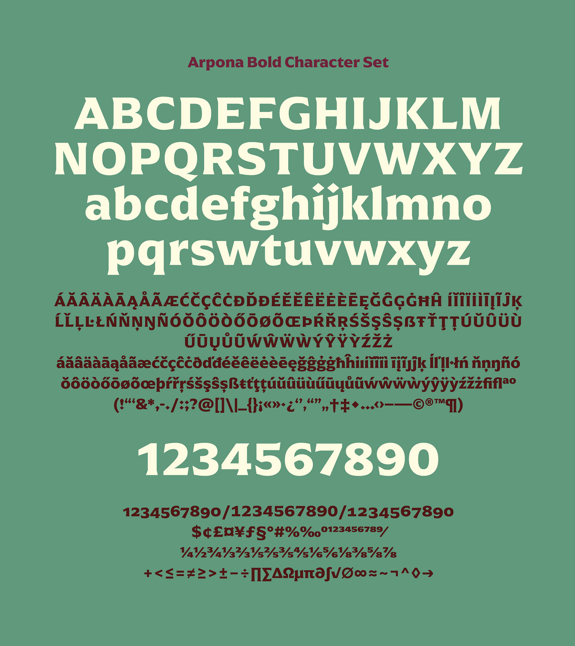
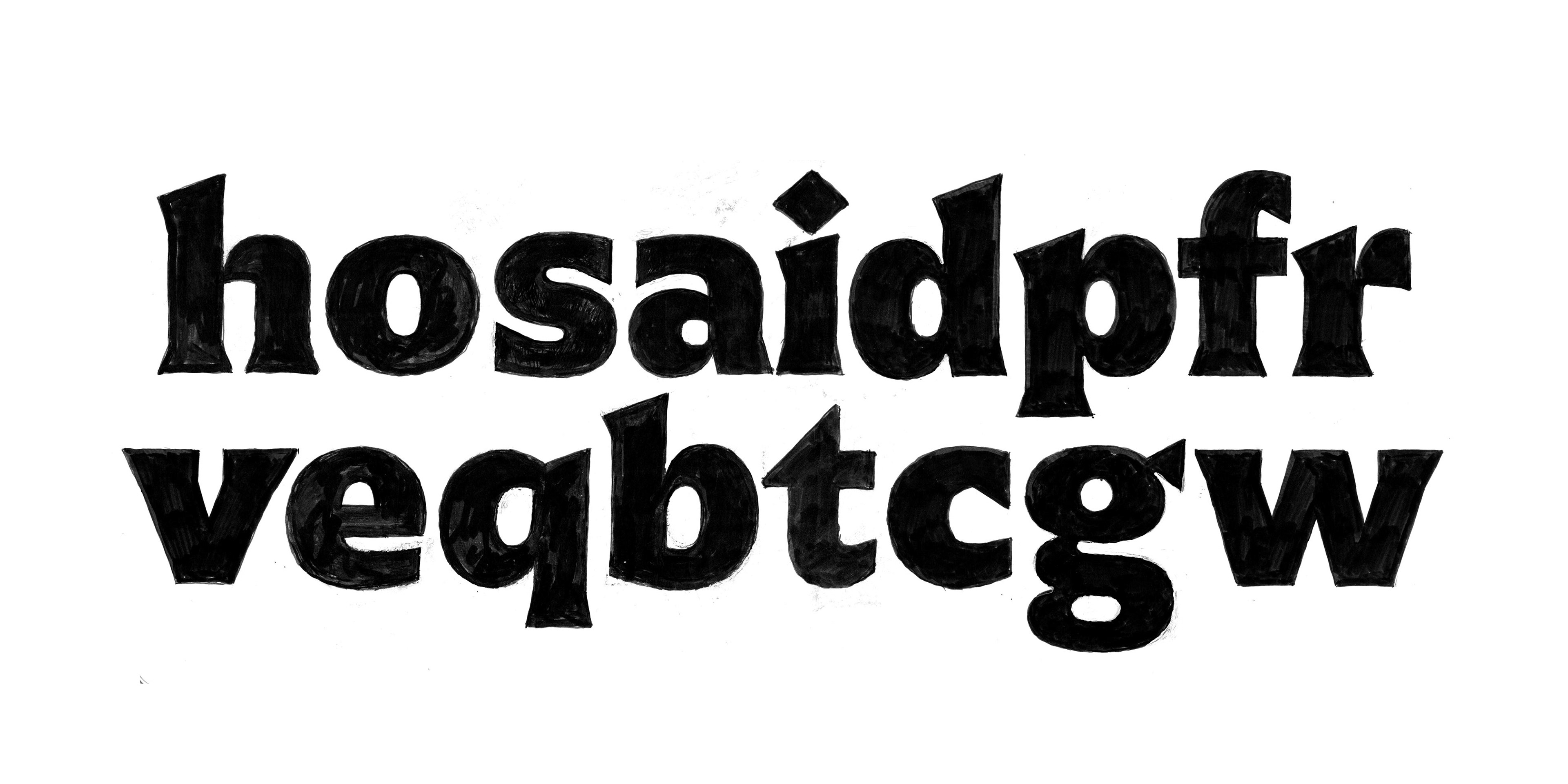
Arpona is a typeface with small wedge serifs and a strong character, ideal for corporate design and all projects characterized by a sense of individualism – for example art, fashion, food and lifestyle topics. It is inspired by roman letters carved in stone but otherwise difficult to categorize. It is neither a serif nor a sans but rather a symbiosis of different design concepts. Because of its display qualities, Arpona is a good choice for packaging, advertising and editorial design and is well readable even in running text on screen.
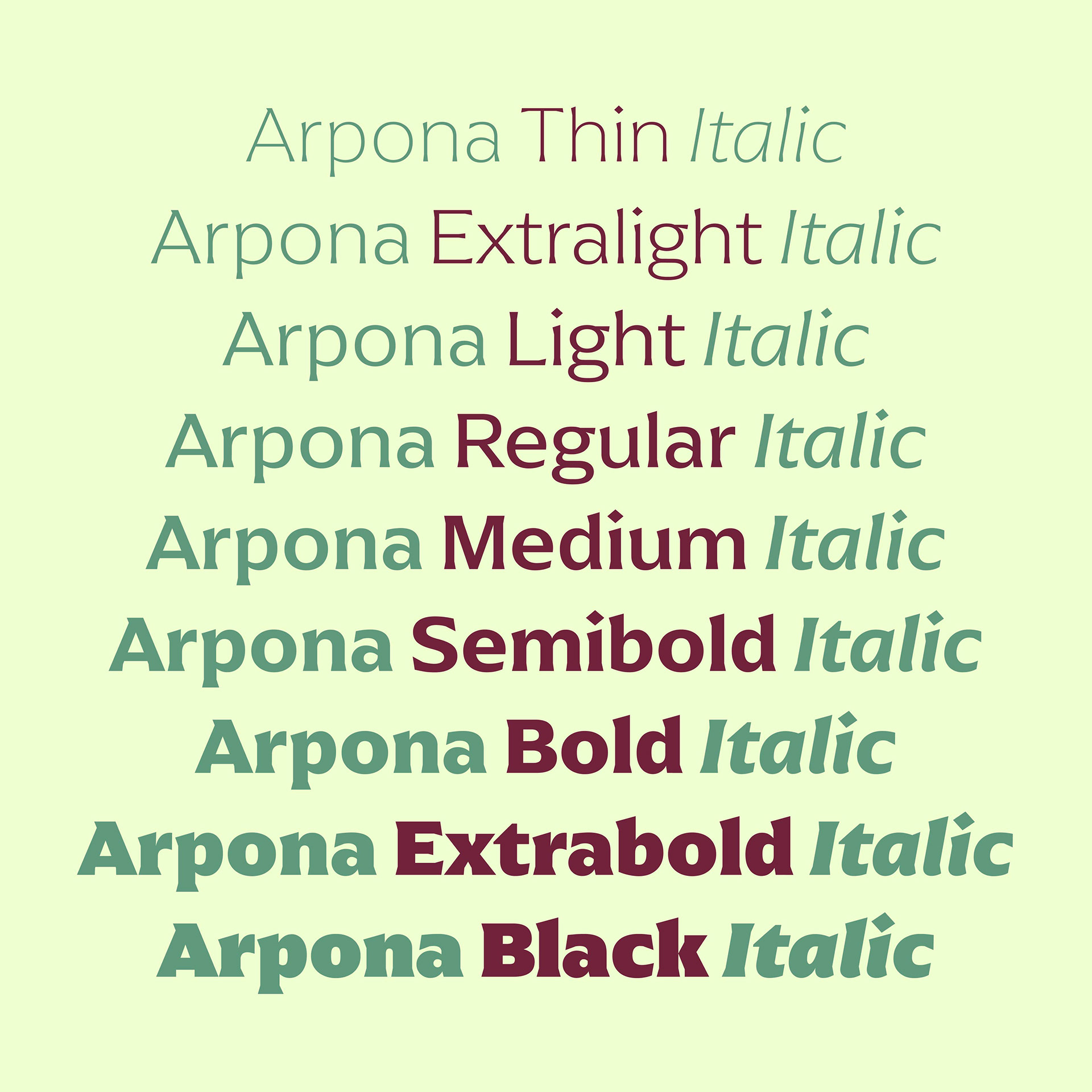
The family has nine weights, ranging from Thin to Black plus corresponding italics. Each style includes 590 glyphs supporting all western-, eastern- and central-european languages including four sets of figures and various currency symbols.
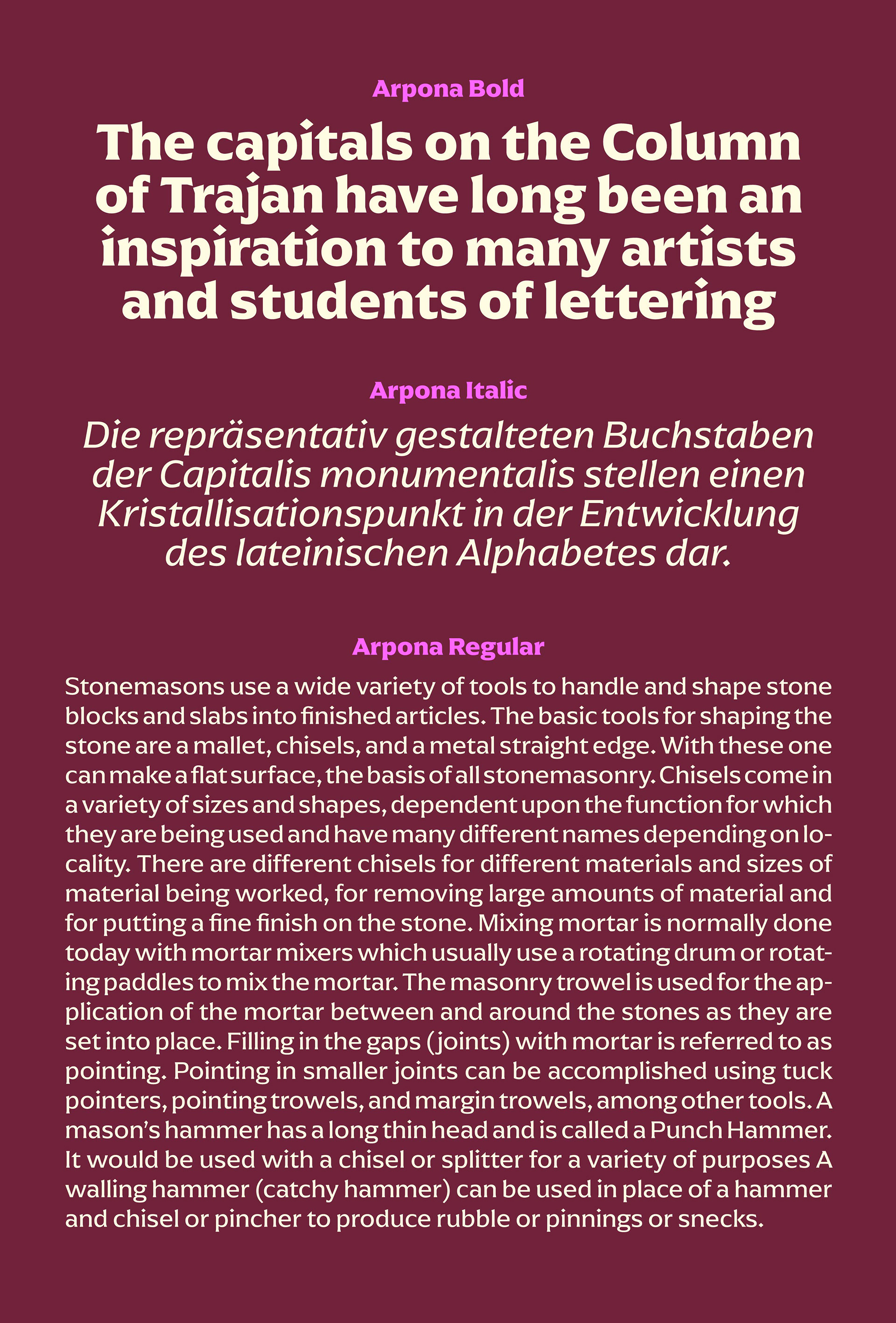
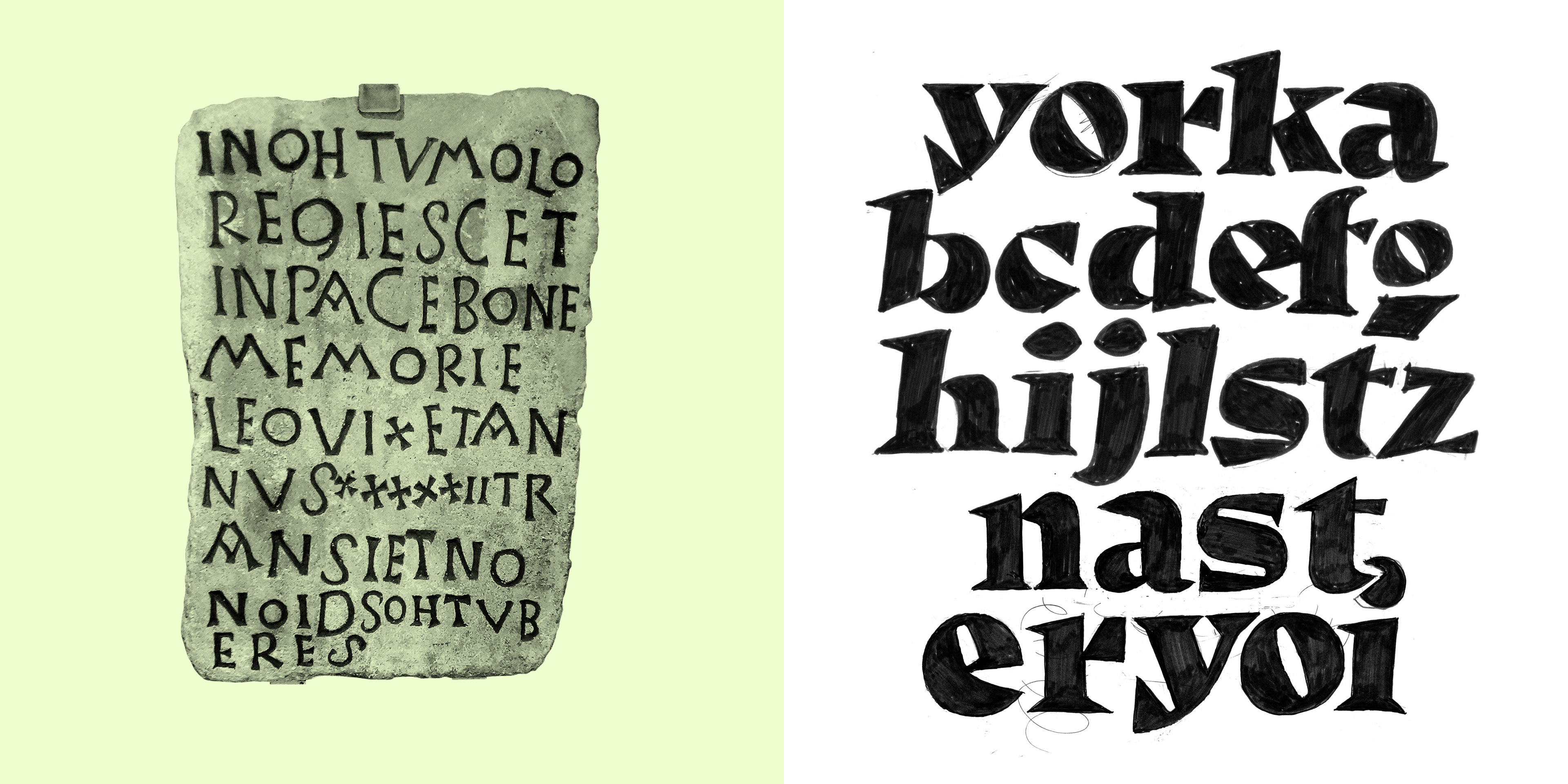
In all my type designs I start with a hand-drawn sketch. Even with Arpona I had this rough idea in mind, but still no clue how the letter shapes should look like. Free quickly drawn idea sketches help me to find a form. While working on Arpona, the Roman Germanic Museum in Cologne was a valuable source of inspiration because there are countless ancient stones with Roman inscriptions. What intrigues me most are those who do not correspond to the ideal, but those in whom the used tools and materials can be identified. Stone is not easy to work with, and the hammer and chisel are no filigree tools. You have to use force to apply it and mistakes can not be corrected. Also, the design process of the first Humanist Sans by Edward Johnston and Eric Gill for London Underground was a valuable source of inspiration for me.
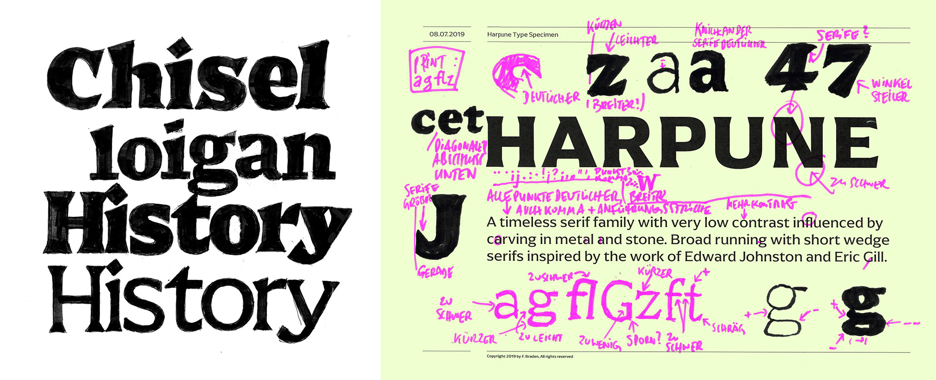
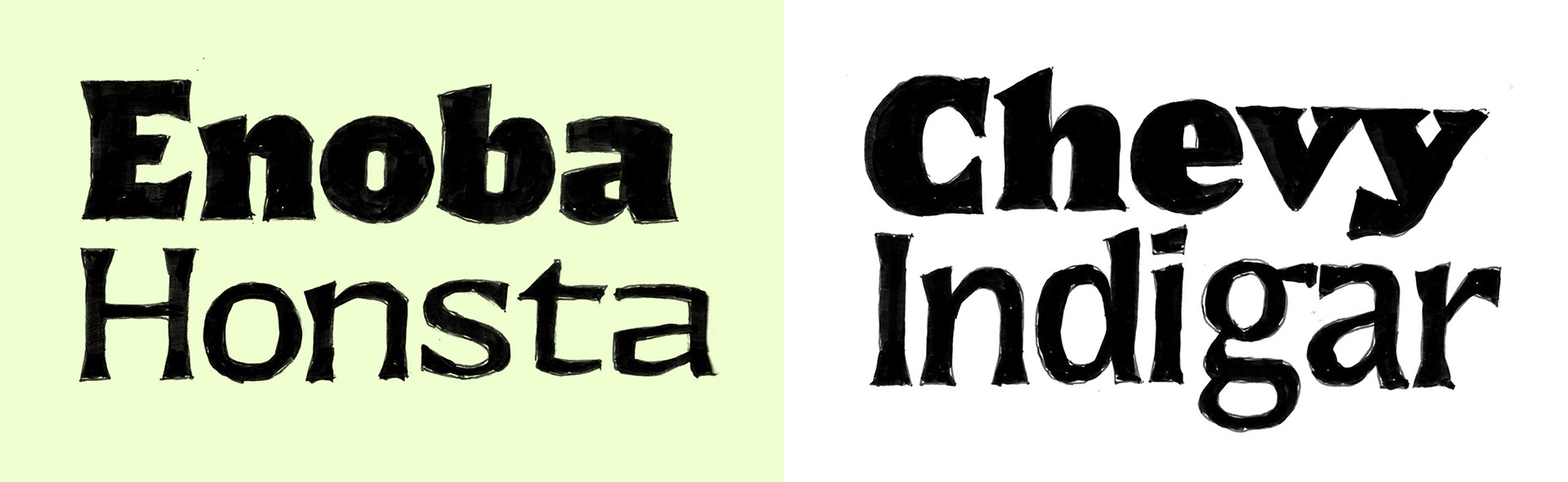
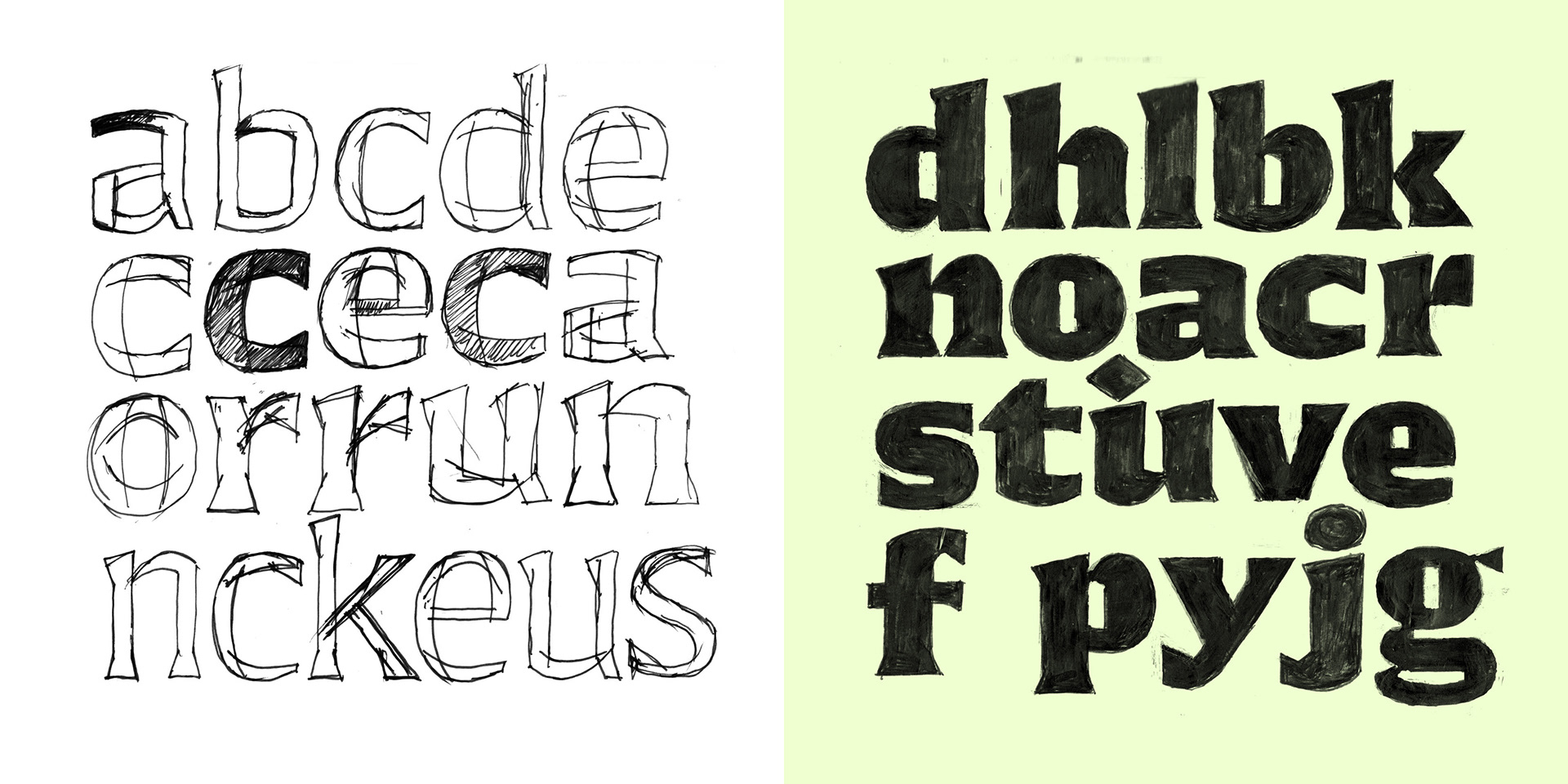
When a direction had emerged from my ideas, I started testing whether the concept would work as a whole alphabet or even as a complete family. Again, for me, the hand-drawn sketch is the fastest and most effective way of realisation. However, it was not until I wanted to test the glyphs in text, that I began with the digitization of the first letters. As soon as the typeface proved itself in copy text, I immediately began implementing it as a family: the masters and the number of styles were defined. Then I digitally revised and tested it until all the characters fit harmoniously to each other and a clear and calm type face arises.
If you like to read more or to see the webfonts in use visit the Arpona microsite.
Arpona is available in the Adobe Creative Cloud and via MyFonts.
Until June 19st 2020 it is 70% off on myfonts.com.
Thanks for your appreciation!