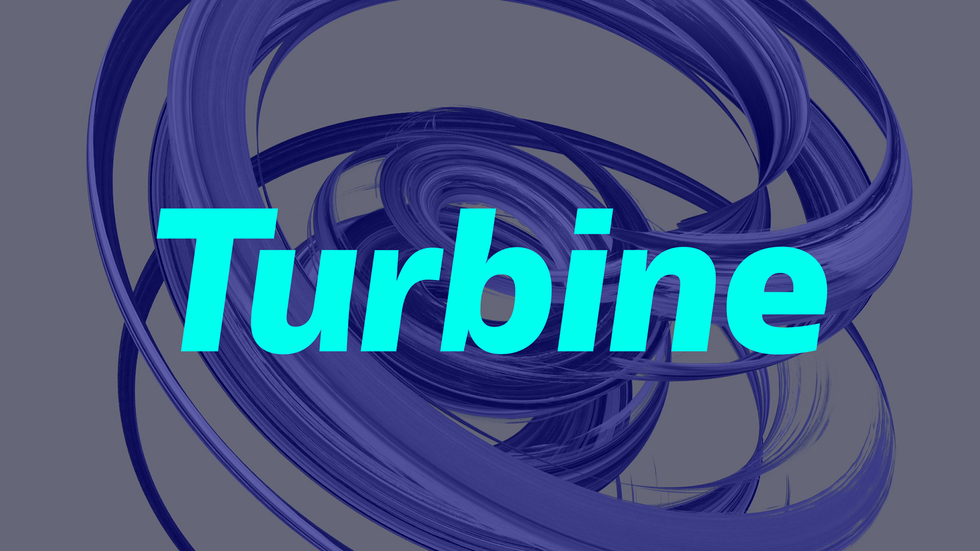
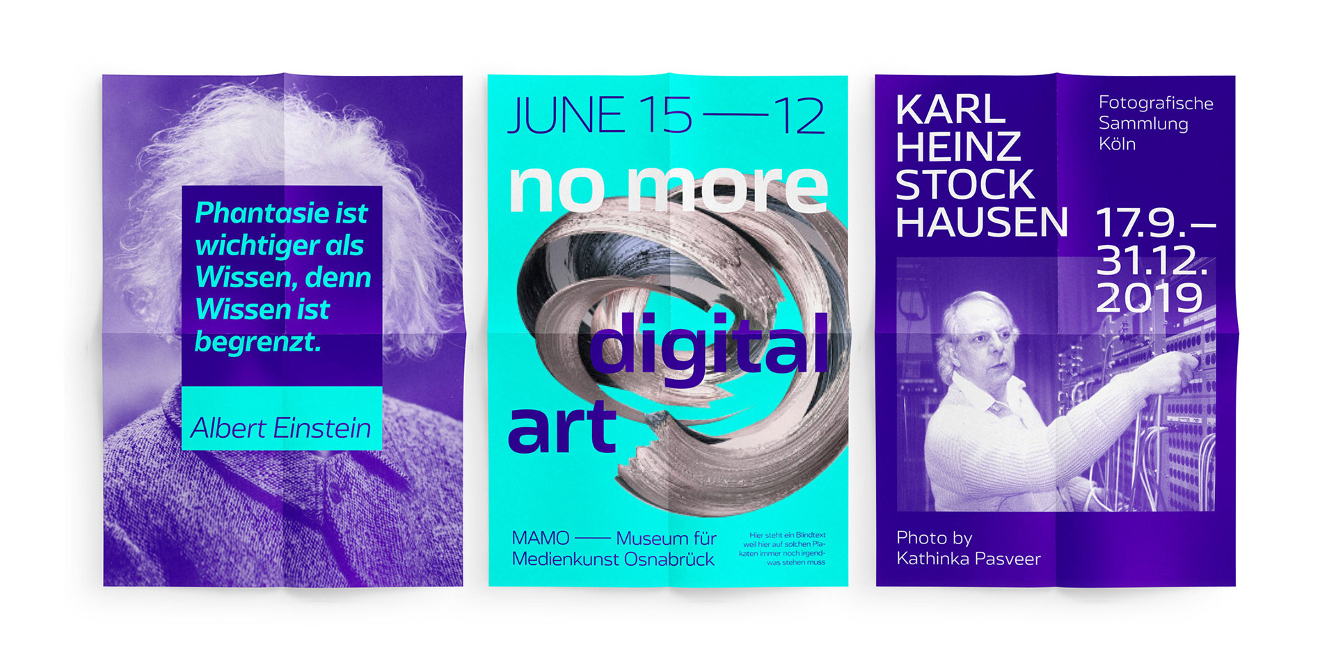
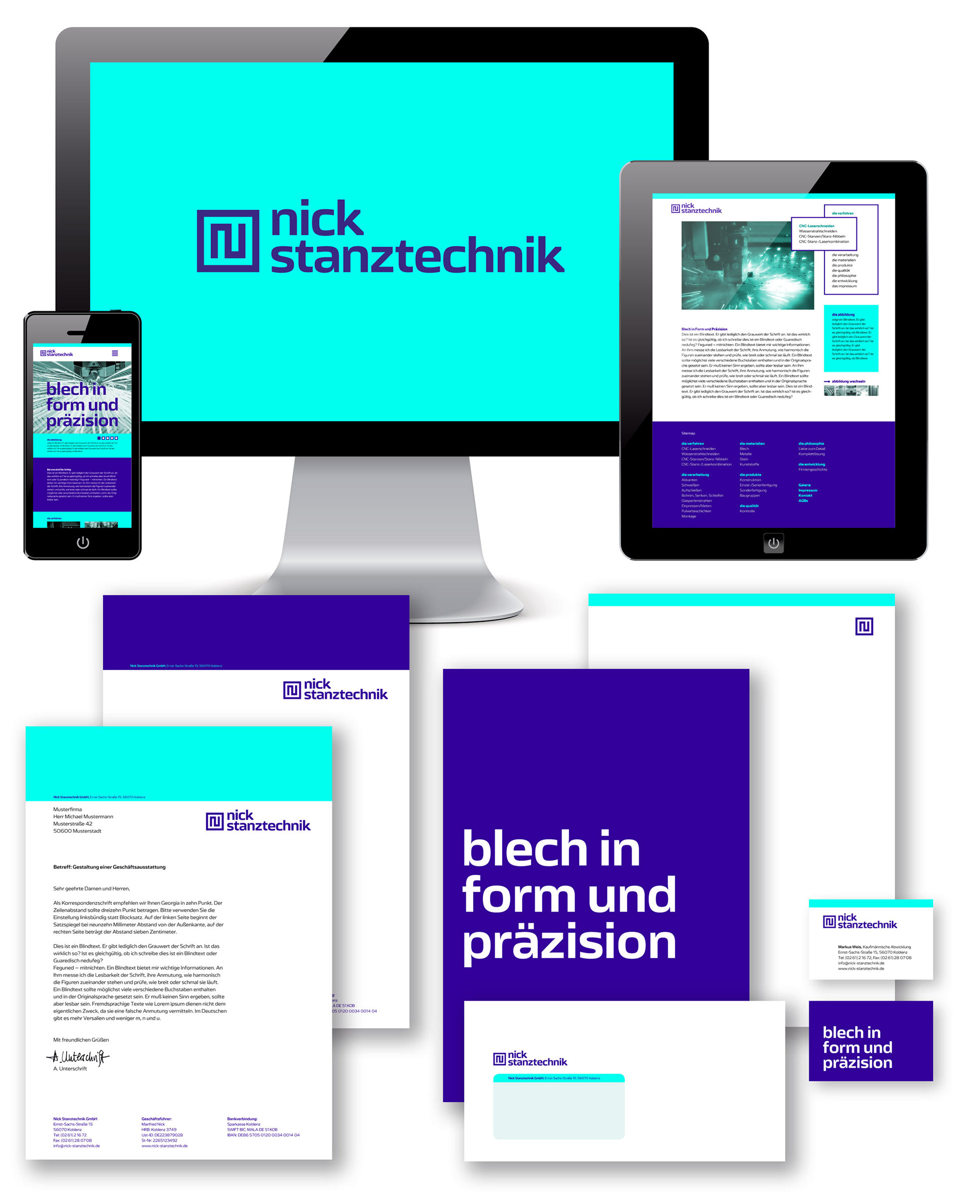
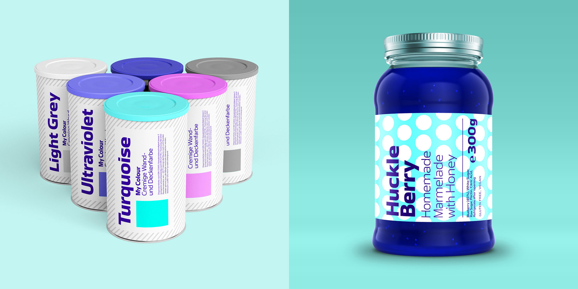
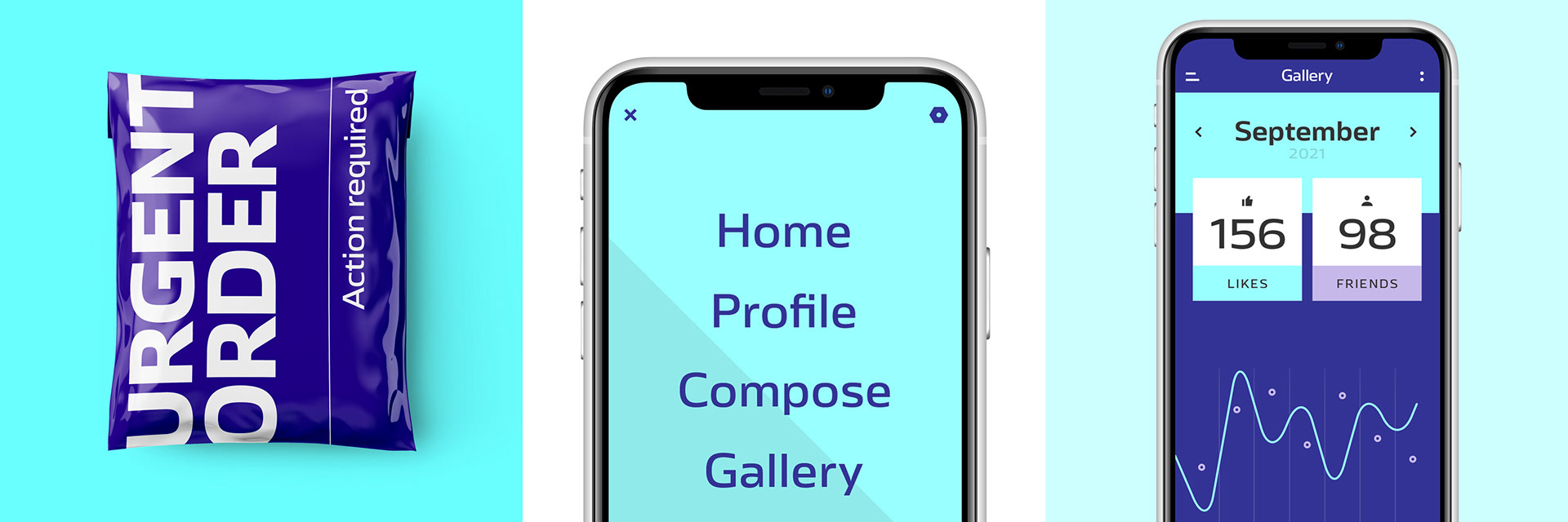
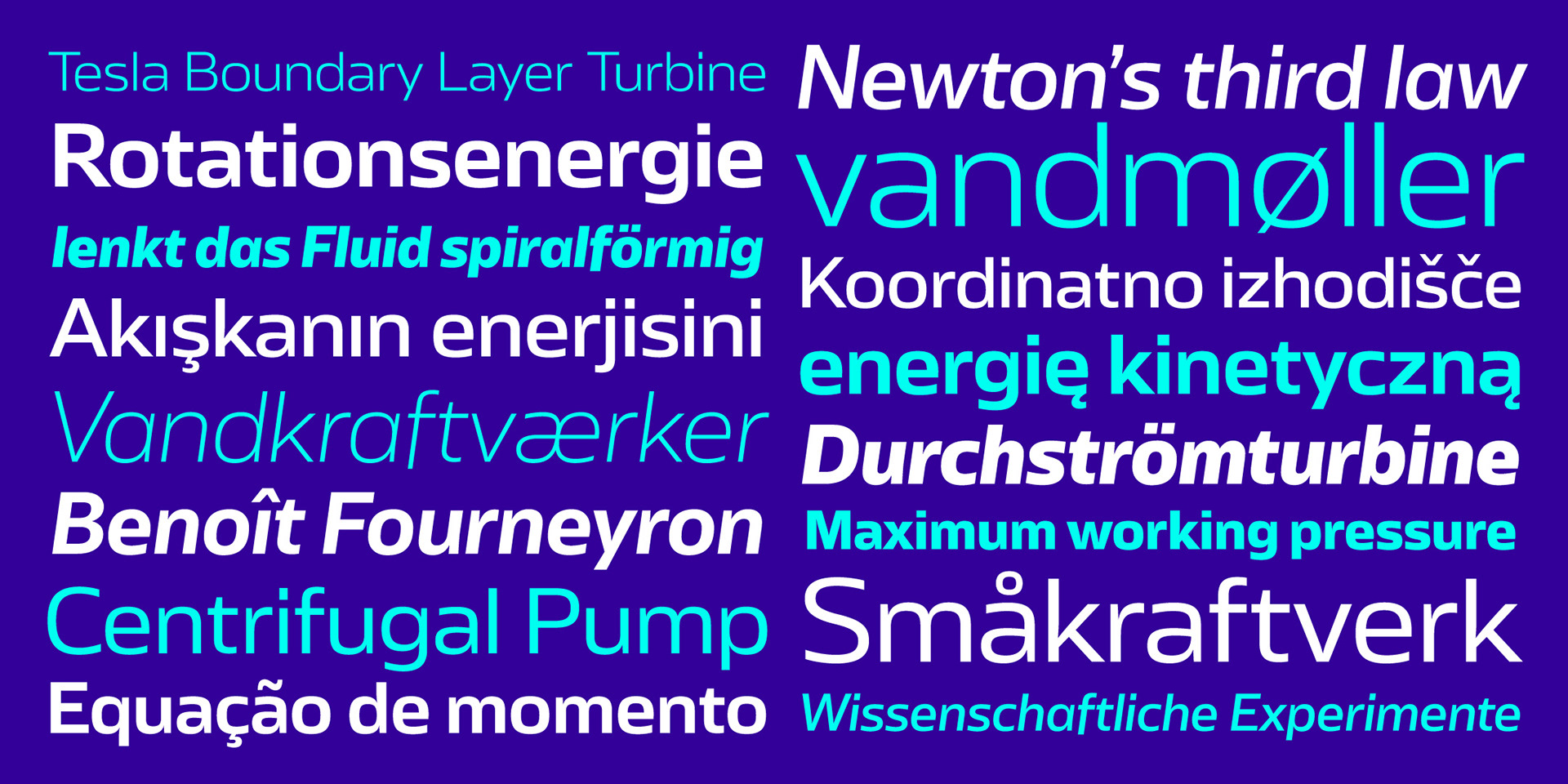
Turbine is a sans serif typeface with superelliptic curves and open apertures. Its distinct character makes it a great choice for corporate design and branding projects. Low stroke contrast and angular curves work perfect on screen and make Turbine very suitable for webdesign and app design.
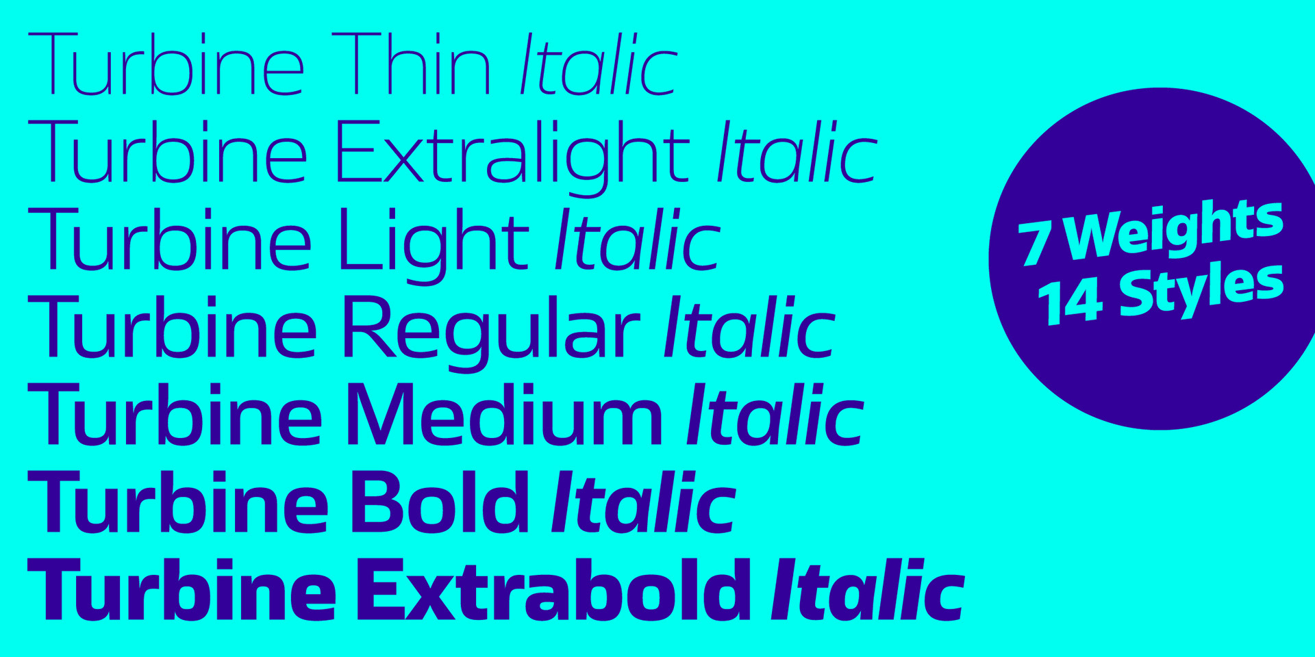
The family has 7 weights, ranging from Thin to Extrabold plus corresponding italics. Each cut includes 489 glyphs supporting all western-, eastern- and central-european languages with four sets of figures and currency symbols.
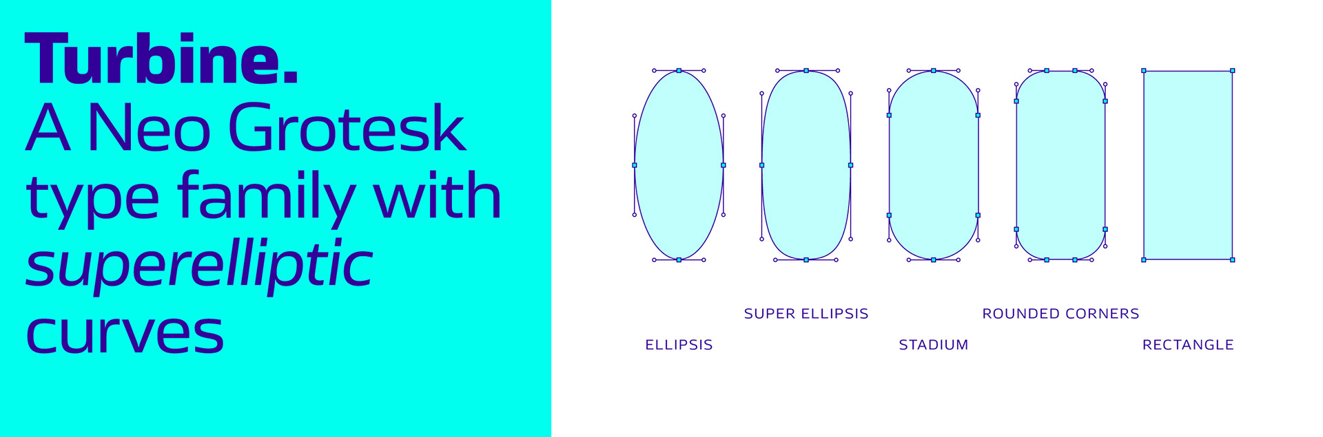
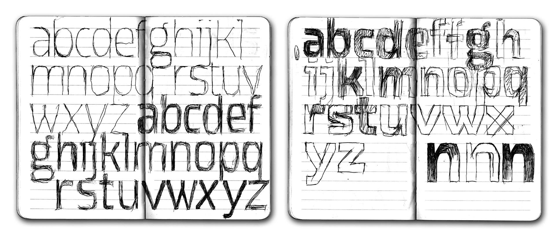
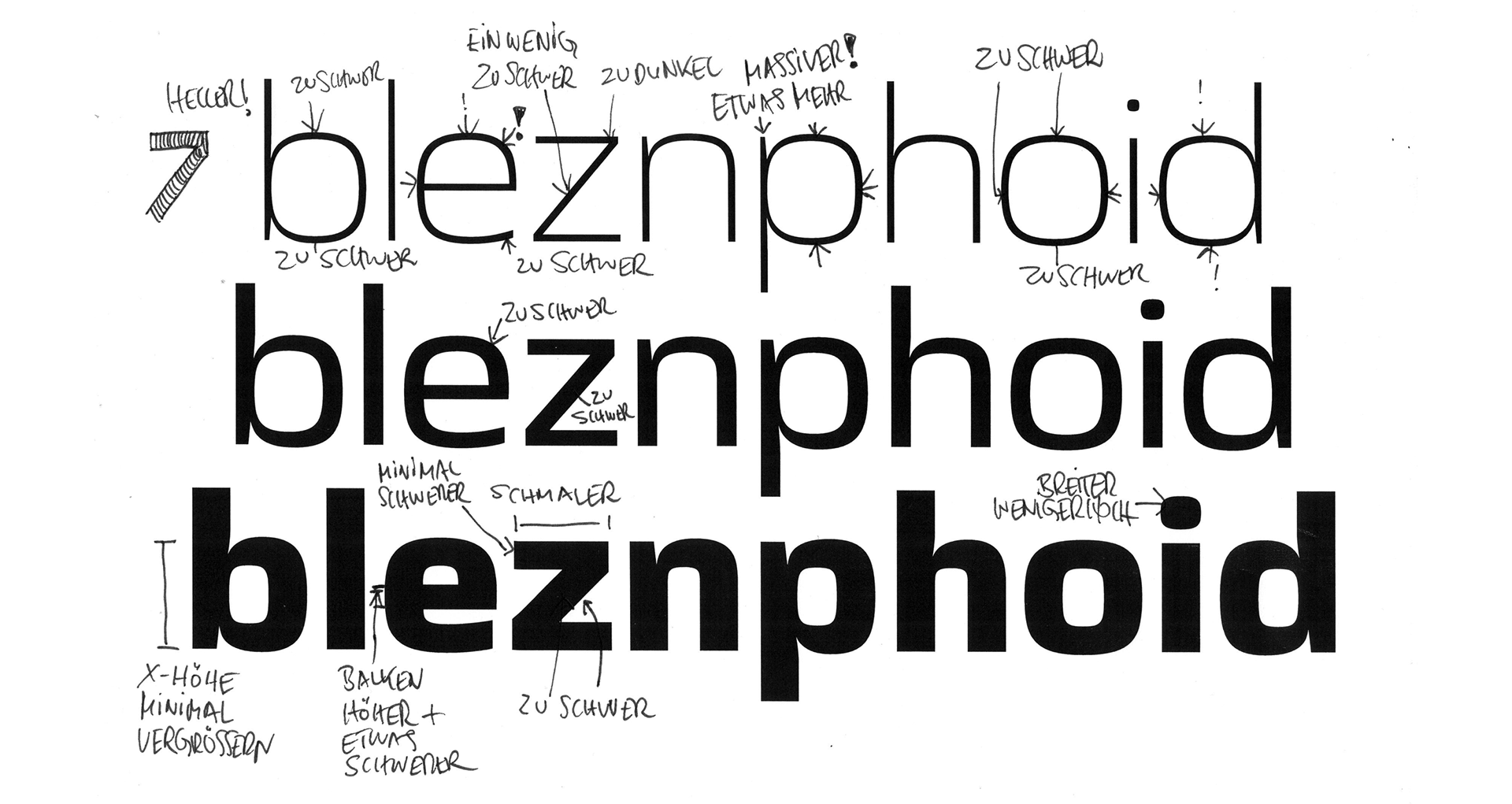
The first idea for the design of Turbine was to use a multiple master axis for a unusual purpose. Normally there is a weight axis, or a width axis – even optical sizes are usual. So I experimented with a serif axis or a contrast axis. But finally I worked with an axis for the roundness of the curves.
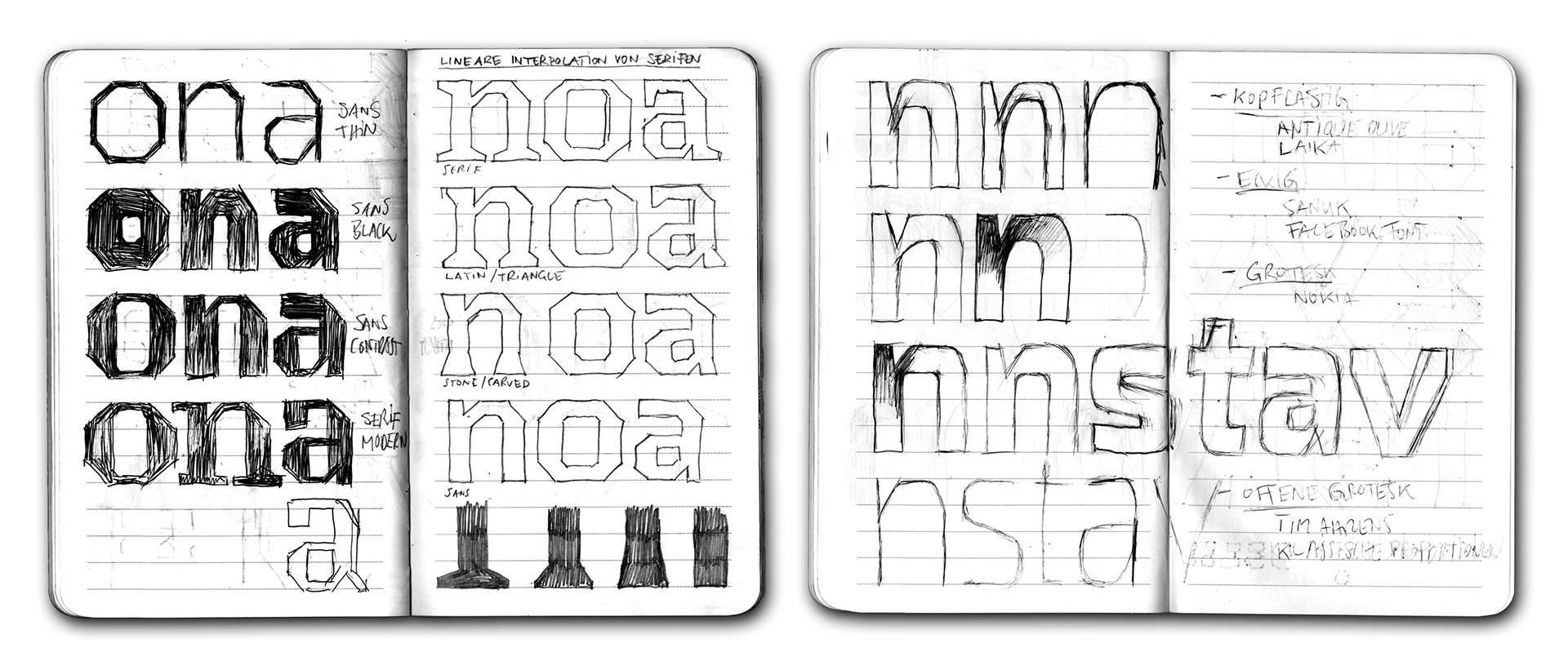
After several phases of testing I realised that the nearly circular formes look boring and nearly rectangular formes are too quirky. I found out that there is only one curve that works better than all the others and I decided that the roundness axis is not a concept worth a variable font but was a very helpful design tool
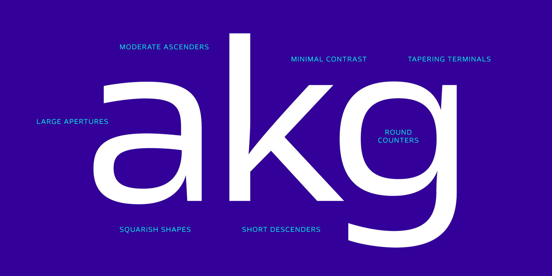
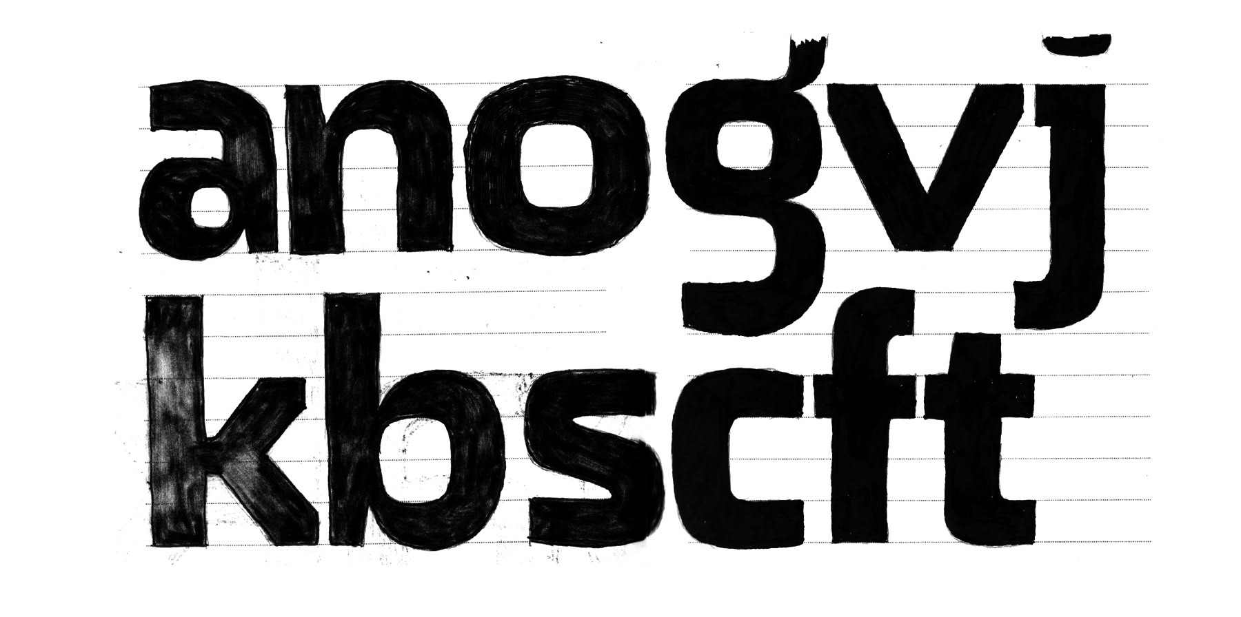
When I realized, that the character of the typeface is defined by the distinct curves, I decided to eliminate a couple of eccentric details to make it more useful for a broader audience. For example I removed the vertically cut diagonals and just kept the tapering stem terminals as a special feature.
Licenses and free trial fonts are available via: www.fontwerk.com
For more testing options please visit the microsite
Thanks for your appreciation. Comments are very welcome.